The view of Carein online store

UX optimisation

Carein - online store UX optimisation

Carein is a brand offering dermosupplements based on ingredients tested and verified by specialists. The Carein online store makes it easy to explore the full range, understand how each product works and choose the ones that best suit your needs.

Introduction

The Carein team approached us with the need to organise and improve the user experience on their website. The key objective was to present products more clearly and increase conversions through clearer messaging and a more intuitive purchasing journey. Together we planned the work, which included analysis, recommendations and the design of new solutions. Work carried out:

  • UX audit divided into mobile and desktop versions

  • Graphic wireframes refined with a focus on UX and UI

  • Recommendations for improvements based on analytics data and observations of user behaviour

Mobile view of Carein online store

Implementation process

We started with a full UX audit. We used behavioural analysis tools, including heatmaps, to see how users move around the website and where they lose interest. This data helped us identify areas where users focused their attention and those where they most often left the site. Based on this, we created a detailed list of comments and recommendations. The results of the audit were discussed together with the Carein team. We then set priorities so that we could focus on elements that would realistically improve the user experience.

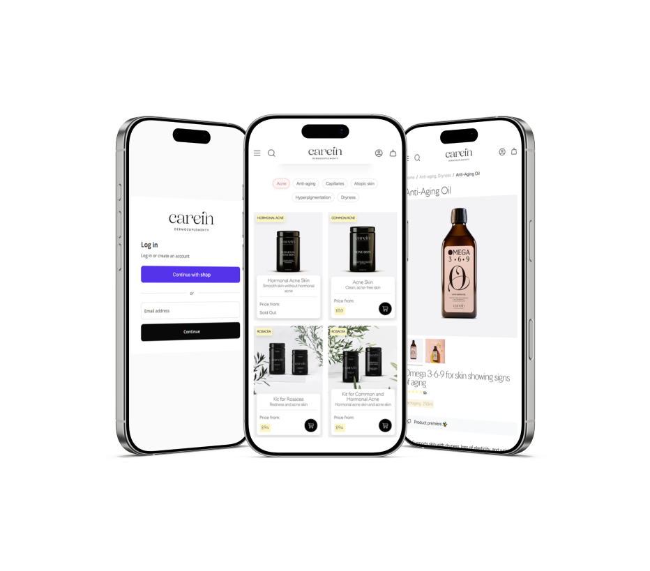
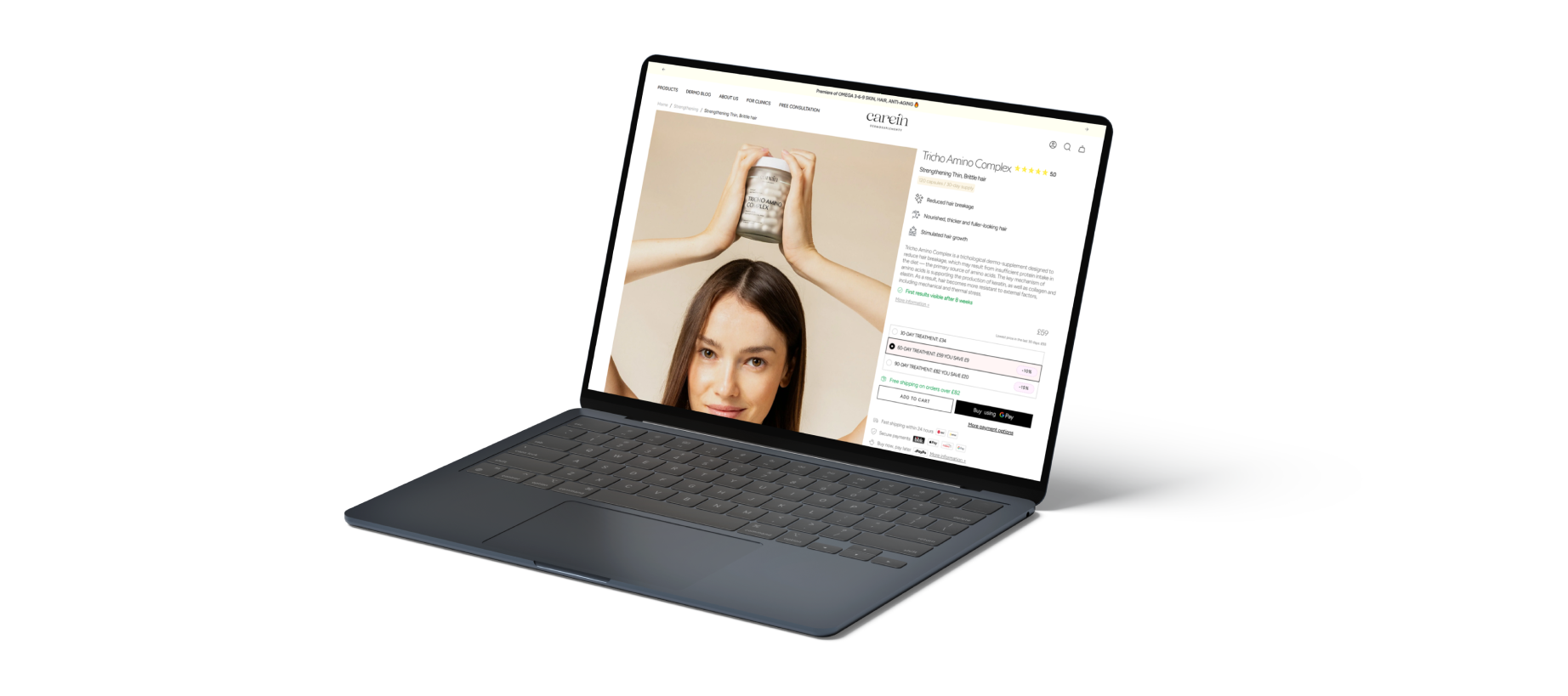
Next we prepared designs for new views. Each of them was consulted with Carein and gradually refined in detail. We ensured visual consistency, clear presentation of information and intuitive guidance through the successive steps of the purchasing journey.

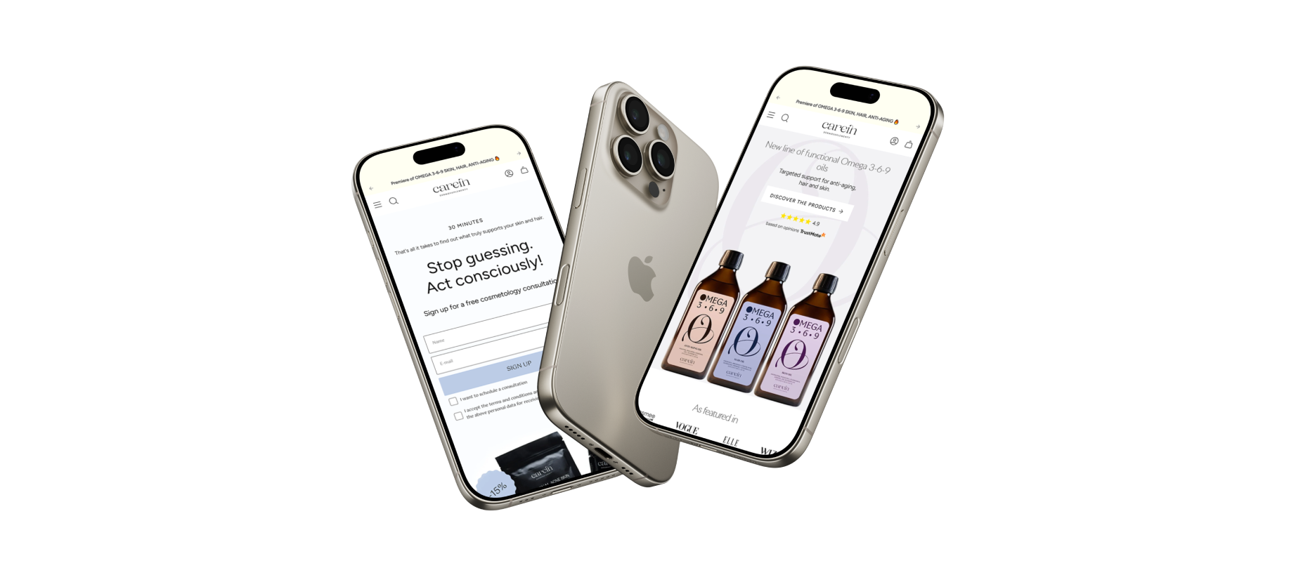
The next stage involved preparing the presentation of a new product range. Our goal was to ensure that the new offer would be visible and understandable for users while naturally fitting into the company’s existing operating model. We proposed solutions that clearly communicate the introduction of the new range without disrupting the architecture of existing categories or the main sales direction of Carein.

Desktop view of Carein online store
Product list on Carein online store

Summary

Thanks to the analysis and implemented changes, we improved the clarity of product presentation and simplified the purchasing process on both mobile and desktop devices. Key sections of the website were optimised to increase user engagement while maintaining a modern look for the store.

At the same time we designed the presentation of the new product range so that it integrates smoothly with the store’s main offer. The implemented changes increased user engagement and gave the website a modern and consistent character.

Carein product card on desktop
Catherine Sobon Sopchy Software House

Let’s talk about your project and needs